Printing and Binding Techniques for Beautiful Books
- lizzysilverton
- May 26, 2022
- 4 min read
Updated: May 30, 2022
Lizzy Silverton
Creating a book that readers can’t help but pick up is one of the best parts of the job.
Choosing the right case materials, head bands and endpapers, opting for coloured page edges and interesting binding styles, and optimising jacket design with foils and debossed lettering, while retaining a style that is sympathetic to the content, can all serve to elevate the book to an art object in and of itself.
The variety and complexity of print finishes are evolving all of the time, as is the quality of what can be achieved at all price points. We love meeting with printers to see what they have been working on and troubleshooting design ideas with them.
Here we are showcasing a selection of the beautiful books from printers in Italy, the Netherlands, Turkey, Slovenia and the UK to explain a range of finishing techniques.
Tipped-in Image
A tipped-in image is one where the cover image is printed discretely from the jacket and is then glued to a debossed area on the case of the book. The debossing protects the image from damage or from lifting up as it sets it below, or flush with, the level of the cover cloth. While you can print an image to give the impression of it being tipped in, there something beautifully indulgent about the real thing.


This beautiful example from Rizzoli, printed in Italy by Graphicom, shows red cloth binding with a tipped-in image on a debossed background.


This stylish book from Gestalten, printed in the Netherlands by Wilco Art Books, uses a tipped-in image on a cloth binding with black foil-blocked lettering crossing over from the cloth onto the image itself.


I project managed this example from Royal Collection Trust, designed by Mick Keates and printed in Turkey by Ofset Yapimevi. The case has a tipped-in image front and back with a foil border on the case. It is also Swiss bound – where the page block is perfectly bound to the inside back cover with a strip of binding tape – allowing the spine and front cover to open flat and reducing the amount of image that is lost in the gutter.
Printed Cloth Case
Textured papers, such as Wibalin, can give the feel of a fabric finish, but real printed cloth bindings give an extra level of luxury. Cloth can be used for the entire jacket or for a three-quarter binding, where the spine and part of the cover is fabric while the rest is paper.


The beautiful Book of Citrus Fruits, published by TASCHEN, uses fabric on the case and was printed by Graphicom.


Painting Paradise was published by Royal Collection Trust, project managed by me and printed and bound in Slovenia by Gorenjski Tisk. It uses real cloth for the three-quarter bind and the text, image and logo on the spine are all foil blocked with a white foil. The image of the roller was drawn by the designer taking a motif from the book. The designer had the foiling process in mind and ensured that the details weren’t too fine so as not to fill in. The highlights on the flower on the front of the book were also picked out with white foil.
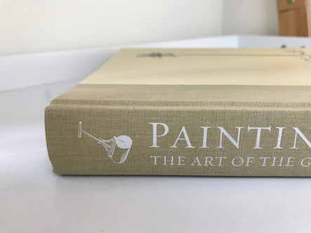
Debossed and Embossed Text
The use of raised or sunken lettering on the jacket of a book adds a stylish elegance. I love the subtle effect of blind debossing, where the lettering is sunk into the case without ink or foil being added on top.


Falling Man was printed and bound by Wilco Art Books, with production by Jos Morree, Fine Books, design by -SYB- and published by Claire Felicie. The jacket, which is a Munken Lynx rough stock, is blind debossed.

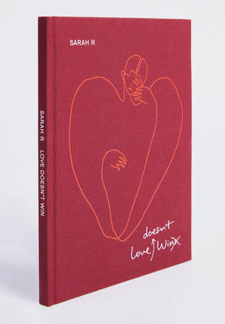
Love Doesn't Win, also printed and bound by Wilco Art Books, with production by Wonderful Books and design by Paul Hetherington, is screen printed with foiled embossing on the cover so the image is slightly sunken against the case.
Die Cutting
Die cutting is where part of the jacket is cut away to reveal elements of the case beneath. There is a limit to how fine the detail of the die cut can be but it can be really effective.


Coollage was published by Komma, designed by Studio Denkwas and printed by Wilco Art Books. The jacket uses die cutting as well as foil blocking and spot UV on the lettering. There is a video of the book being opened to demonstrate the full effect of this design on the Komma website.
Soft-touch Lamination
Soft-touch lamination gives books a beautiful velvety feel.


I’ve used soft-touch lamination on a number of my projects including Masterpieces from Buckingham Palace, printed in Wales by Gomer Press and Portrait of the Artist, printed in Ghent by Graphius, both published by Royal Collection Trust. Here the richness of the images lent themselves to the tactile quality of soft-touch lamination. In both cases I finished the jacket with foil lettering to contrast the matt finish of the image, making for a beautiful jacket.
When opting for soft-touch lamination, it’s important to remember that it will dull the colours slightly. This may not be an issue, but if you need to make sure your jacket image matches the colour of an image inside the book it might be might be worth running a wet proof if your budget allows.
Metallic Foil
Metallic foils can be used on lettering but they can also be used within images too.


In this example from Royal Collection Trust, which I project managed, Graphicom printed the butterflies' wings on a foil to give them an iridescent quality. We also foiled the lettering for Maria Merian's name while the rest of the jacket was matt laminated to further the contrast.
With many thanks to Wilco Art Books, Graphicom and Royal Collection Trust for permission to use their images.
Comments